Atmospheric soundings via balloon launch are few and far between, only normally launching twice per day at 00Z and 12Z. Even if you are interested in a sounding at those times, chances are you aren't close to one, as the spatial coverage of these launches is sparse.
However, plenty of aircraft flying overhead at all times of day and night are equipped with sensors that measure atmospheric temperature and moisture and in partnership with NOAA, ingest that data via ACARS. NOAA provides this data at here but there are limited options for viewing this data through the NWS Madis website.
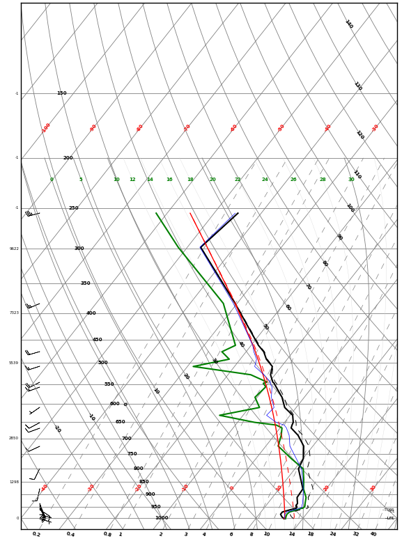
The data used for these plots is publicly available from the National Weather Service. For more information about this data, see this presentation by Rich Mamrosh, a NWS meteorologist in Wisconsin. Having this data available as atmospheric sounding visualizations would be an asset to many people, and particularly the storm chasing community.
To that end, I present the initial release of my visualizations here, at https://wxster.com/acars, which will let you select a date and time (UTC) and select a profile to plot. Each profile is named for the airport the flight either departed from (UP) or landed at (DOWN). Not all of the profiles are complete, and not all are clean. You wouldn't want to initialize a model with this data as-is, but you could certainly use it out in the field if you didn't bring your own balloon launching equipment.
I have plans to improve the site by adding the ability to browse the soundings by airport rather than by time and to visualize the available soundings on a map.
The sounding data available on the madis site only provides a few days back in time, but I am locally caching these datasets and will have as much history as I have free disk space on this server.
If you are interesting in plotting this data yourself, the plotting is performed by my pyMeteo project, which you can obtain via pip, anaconda or github. The plot acars command that is installed by this package will let you plot this same data with a little bit more than appears on the site currently.
If you want specific improvements to the site or the plots, please open an issue on the pyMeteo github site, as this provides me the most visibility to them and reminds me they exist.
Comments