In my research endeavors I came across the need to overlay two filled contour plots to combine information with context needed to interpret it. I found some older solutions that were quite complicated but managed to find a much simpler solution.
Motivation
First, to motivate the need for two filled contours, here are examples of the data that I was looking at. The data I want to display is circulation, a measure of macroscopic rotation given by: $$\Gamma = \oint \mathbf{u}\cdot\mathrm{d}l$$ This is straightforward to plot:
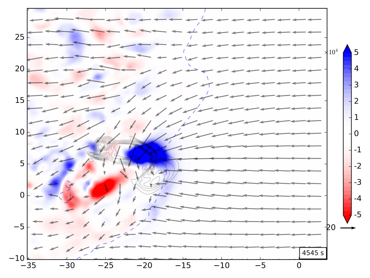
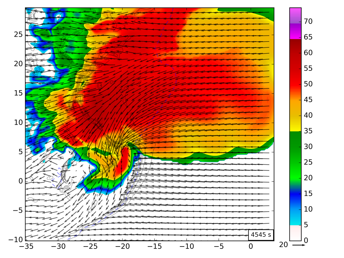
This presentation lacks context for the circulation, which the circulation is located in reference to storm structure. I also have reflectivity (simulated) data, which is similarly straightforward to plot:
One solution to plotting both sets of data together it to switch one to unfilled contour. This, however, makes interpreting the data more work. So how do we combine both filled contour plots into one image?
Alpha blending
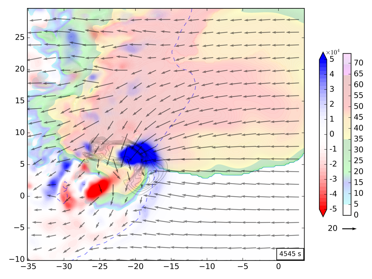
The key to plotting two filled plots is use alpha blending. This can be accomplished by setting the alpha kwarg in the call to contourf. Doing this for both contours though presents presentation problems. Ideally I want the reflectivity data to be a subtle background and the circulation plot to be the focus. To accomplish this I do plot the relfectivity with an alpha kwarg, e.g.
CSdbz = plt.contourf(X,Y,dbz[t,z25,:,:], levels=radar.cmap_radar_levels(),
                     cmap=plt.get_cmap('pymeteo_radar'), alpha=0.2)
For the circulation data I instead modify the colormap to include transparency so that the reds and blues can remain distinct without too much blending.
c_red = matplotlib.colors.colorConverter.to_rgba('red')
c_blue= matplotlib.colors.colorConverter.to_rgba('blue')
c_white_trans = matplotlib.colors.colorConverter.to_rgba('white',alpha = 0.0)
cmap_rb = matplotlib.colors.LinearSegmentedColormap.from_list('rb_cmap',[c_red,c_white_trans,c_blue],512)
This sets the colormap ends to red and blue and uses white to blend them together. This is essentially how the normal RedBlue colorbar works except my white color is completely transparent. This lets the background show through the blank parts of the circulation plot but lets the colors stay bright. I plot this with:
CSc = plt.contourf(Xc,Yc,circ[ct_idx,z25c,:,:], levels=levels, cmap=cmap_rb, extend='both')
The resulting plot is:
Notes
You will have to save the image in a format that supports alpha levels for this to work, otherwise only one of the plots will show. The PNG and PDF output work for producing raster and vector output but EPS will not work.
References
The referenced python modules:
Comments